Graphic interpretation of my home
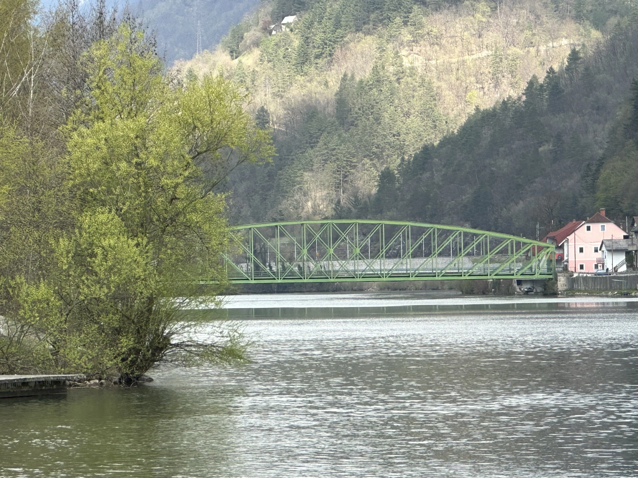
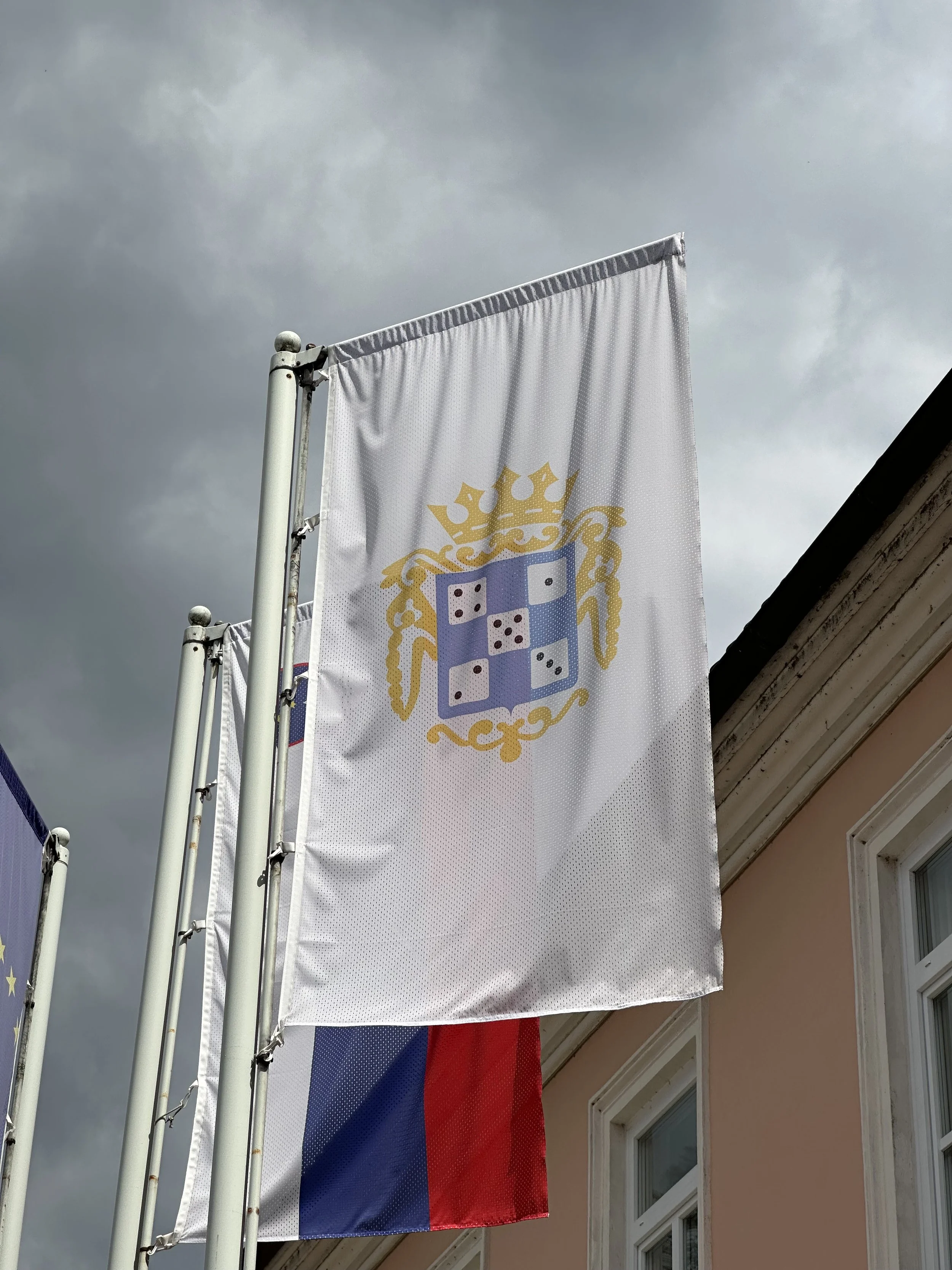
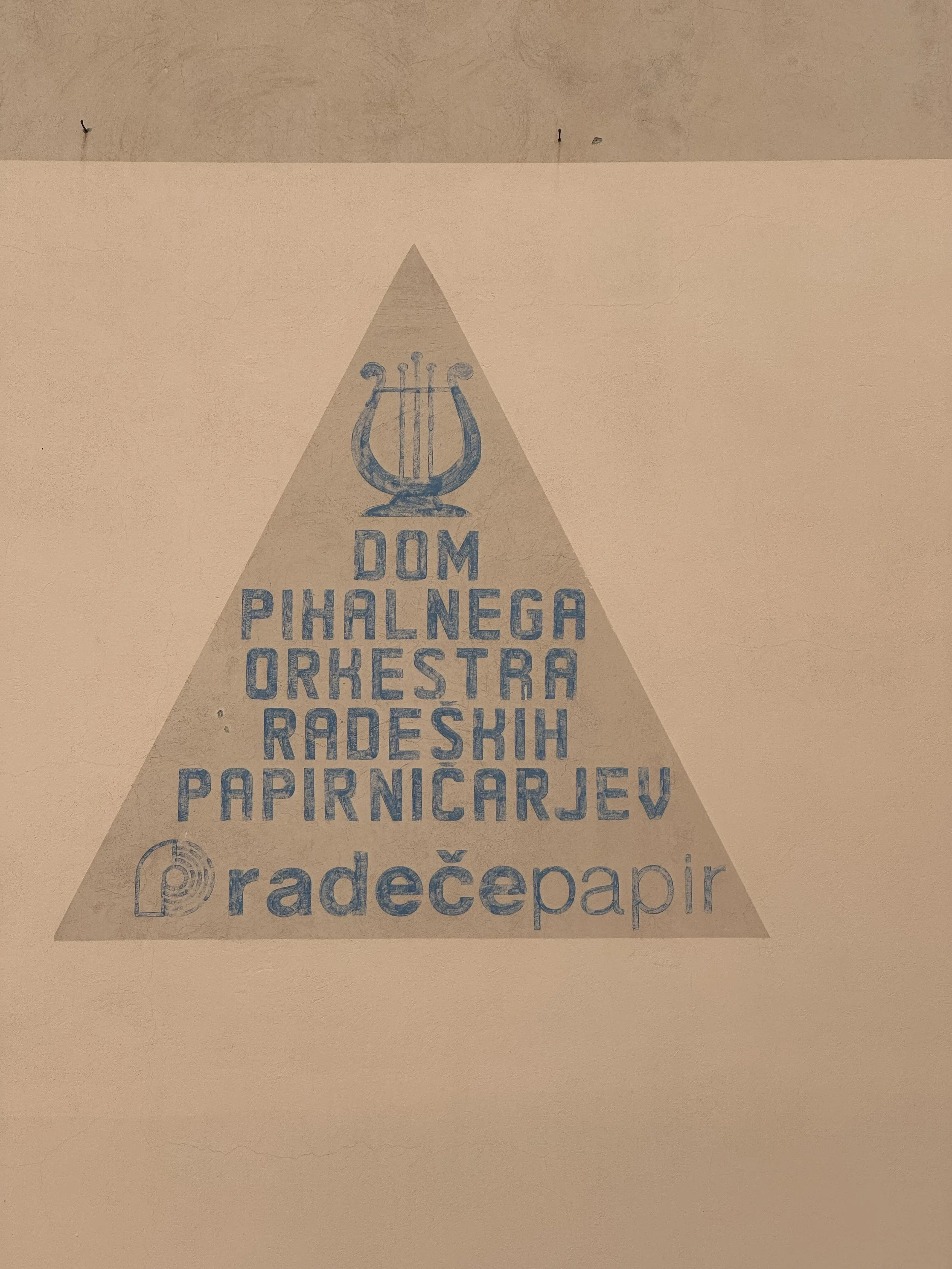
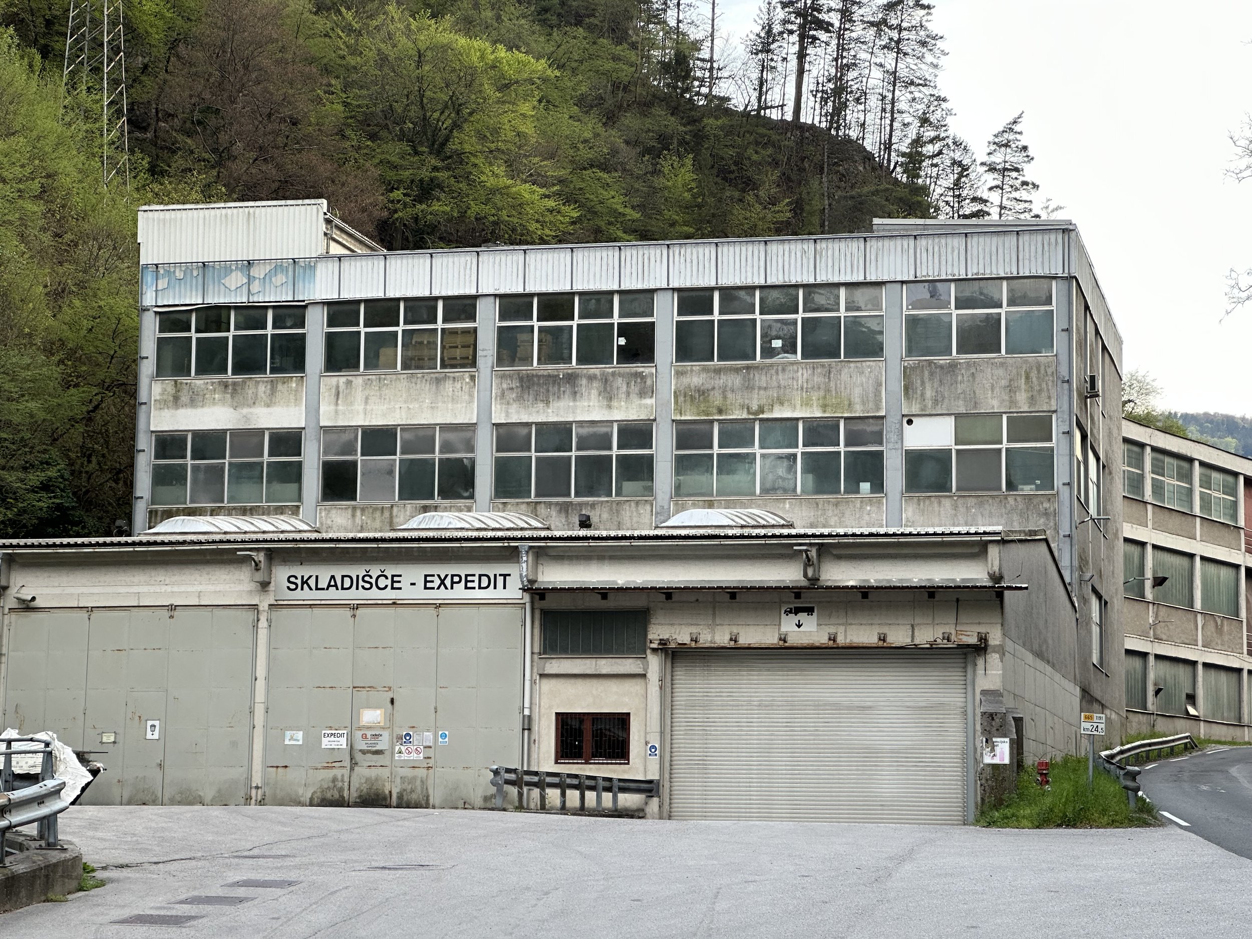
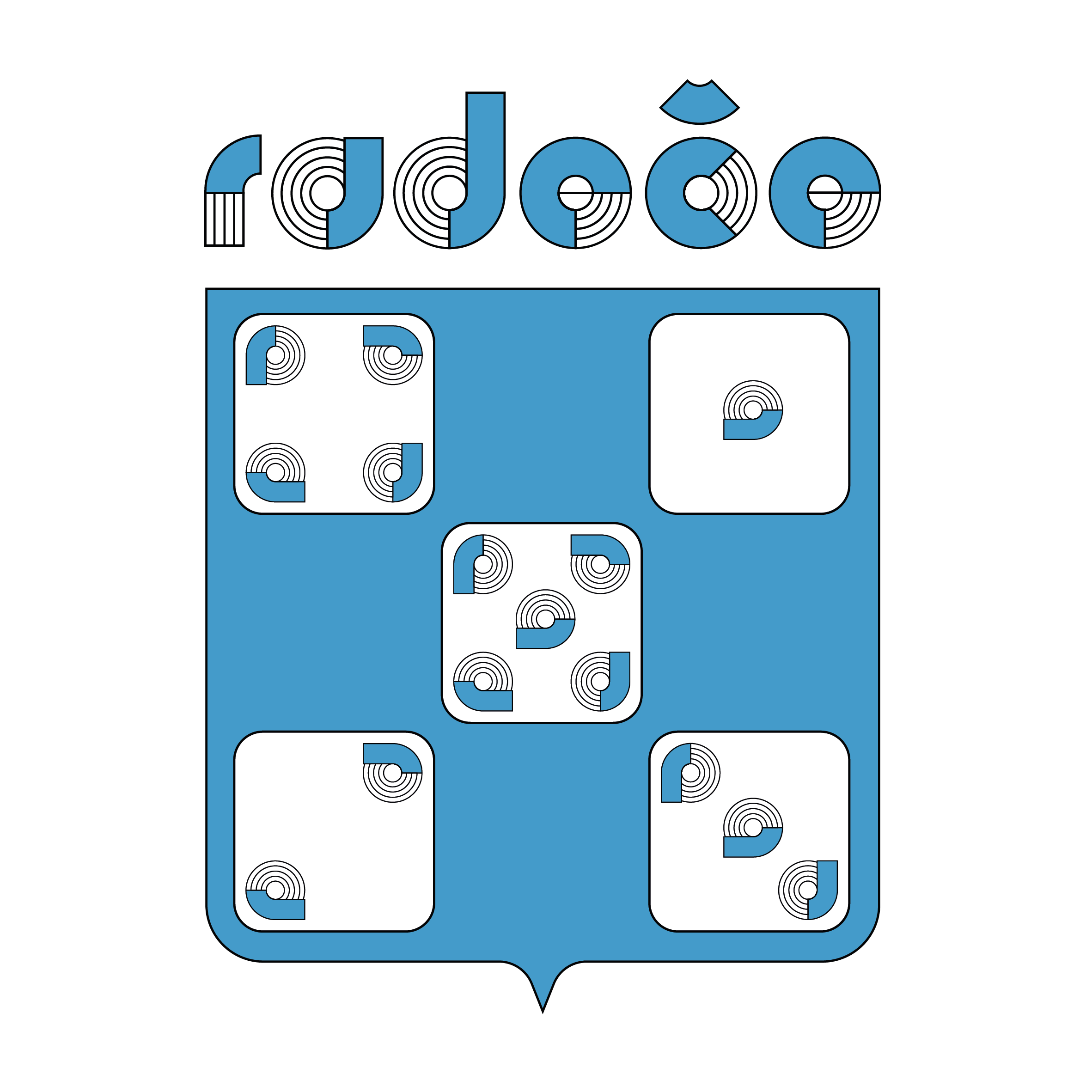
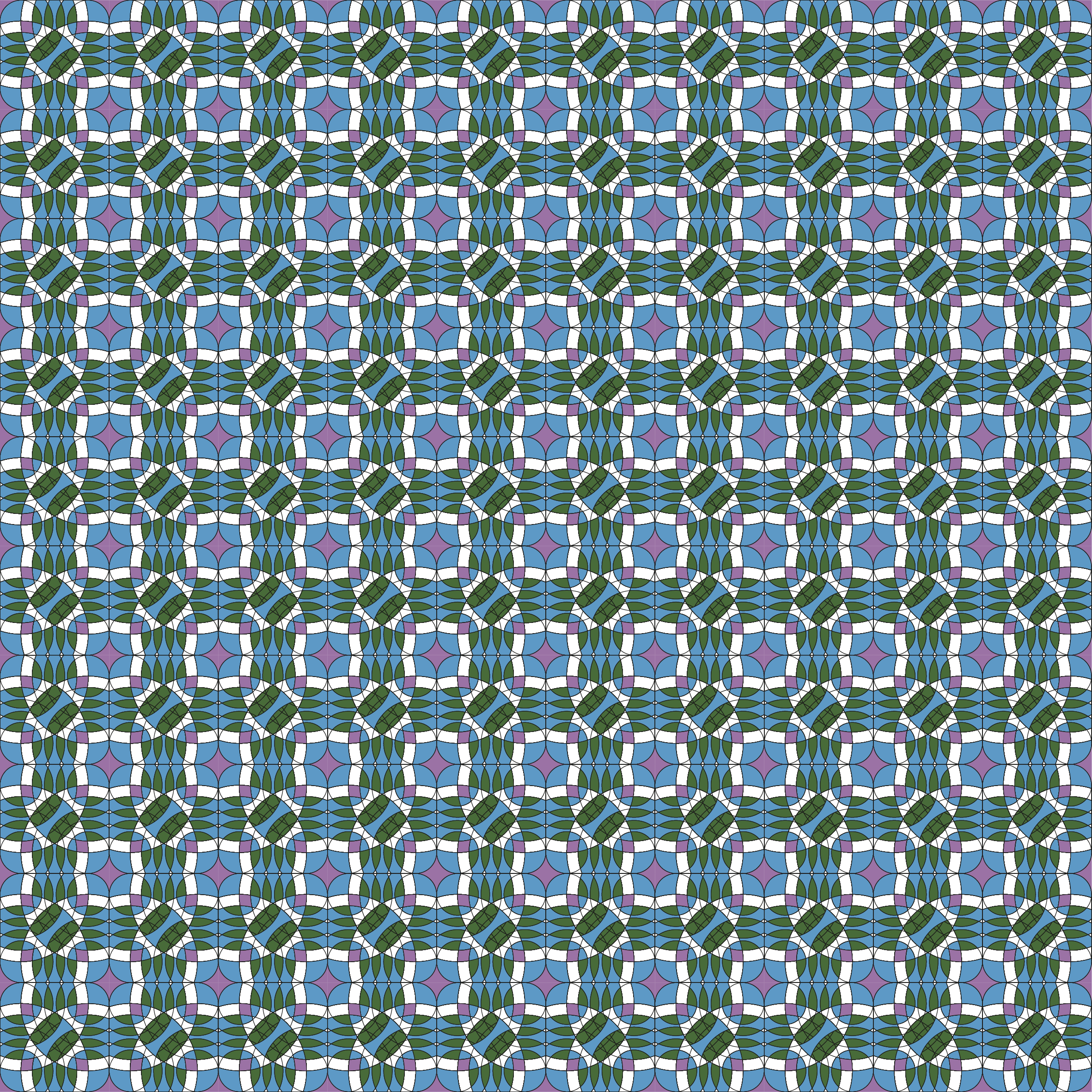
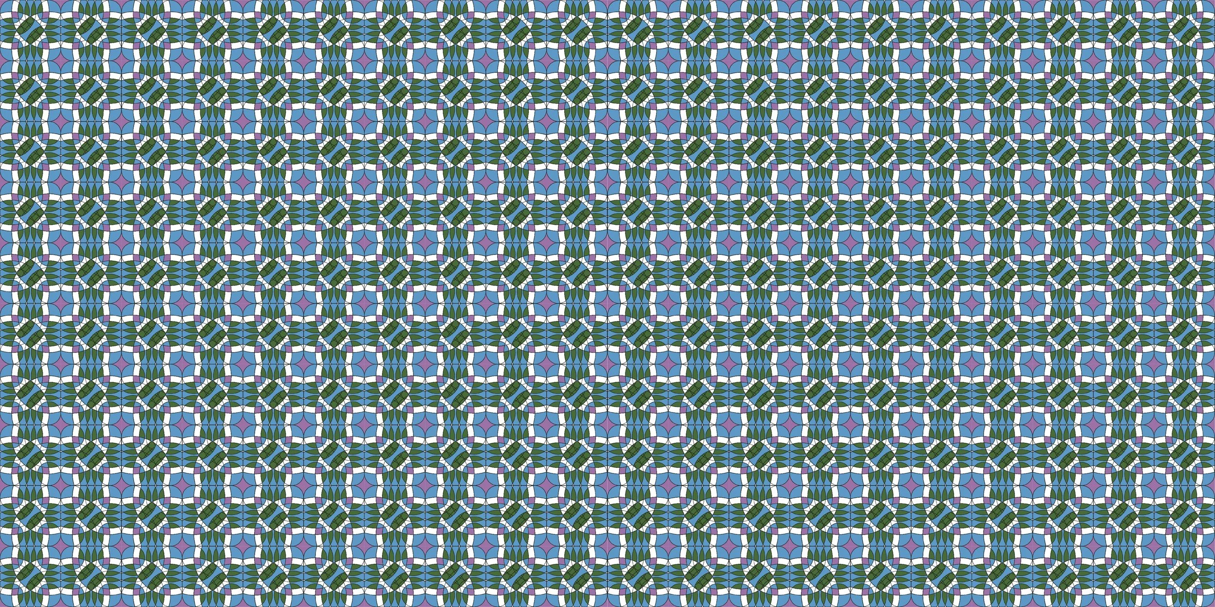
I grew up in Radeče, a small town at the crossroads of several regions, often caught in an identity crisis. To visualize this, I reinterpreted the town’s coat of arms and rediscovered the forgotten logo of the once-thriving Radeče paper factory. From its sign, I created a custom typography for “Radeče” and developed a pattern by rotating and layering the form. Within this pattern, the silhouette of the town’s steel bridge—linking two regions—emerges as a symbol of connection and memory.